Usually when I make a map generator I focus on the underlying algorithms and data. The data will be used by a game project, so the visuals are meant to be informative and not necessarily pretty. For this project I wanted to make the output pretty. I previously blogged about the unusual projection I'm using for the graphics. It allows you to see the rivers and coastlines top-down but see the mountains from the side. There are two other interesting graphical tricks I'm using to make the maps prettier.
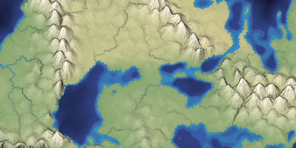
The first is that I'm not using standard lighting and shading. Inspired by this page about shading for cartography, I experimented with ways to make the maps look more like maps and less like a 3D rendering. I still have a lot more experimentation ahead. I may blog about this in the future. Here are some variants:
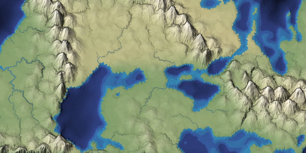
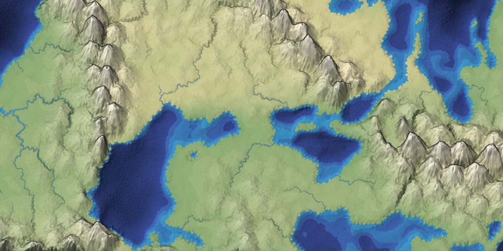
The second is outlines. I'm a big fan of black outlines around objects. In hand-drawn art it's common to draw the outlines of objects, but in standard 3D rendering you don't get this. Here's an image showing the regular 3D renderer on the left and outlines added to the right:
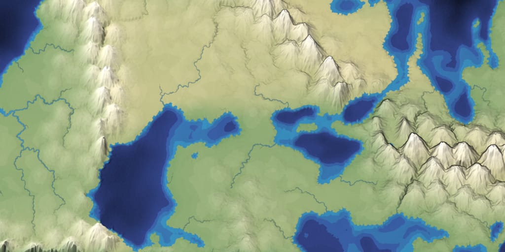
Look at how much of a difference it makes!
So how does it work?
There are toon/outline shaders but I did something simpler. In the first pass, render the map, but output the z value (or elevation) instead of the map color:
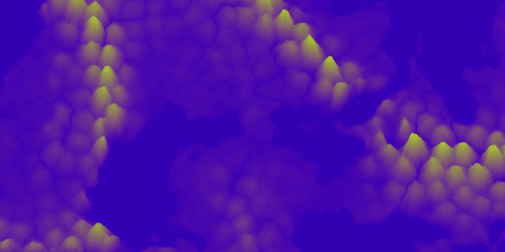
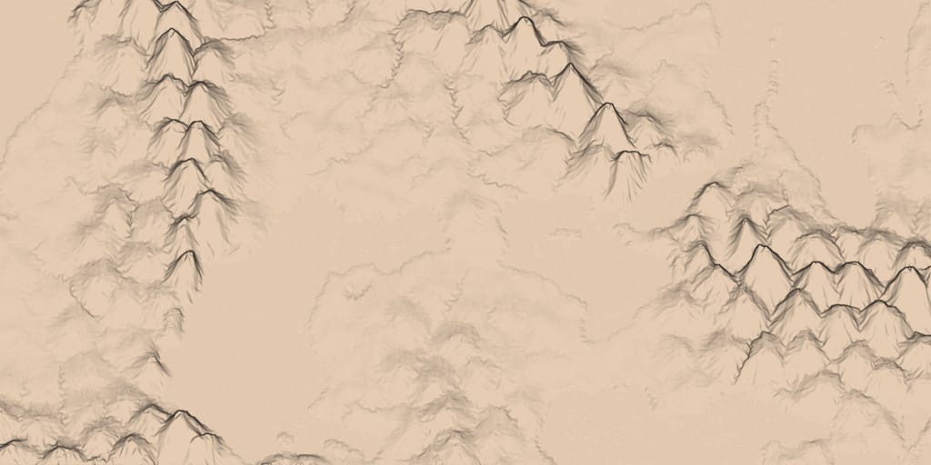
Then I render the map again, looking for differences in the z value. That's where outlines will go. By tweaking the formula, I was able to see hills too:
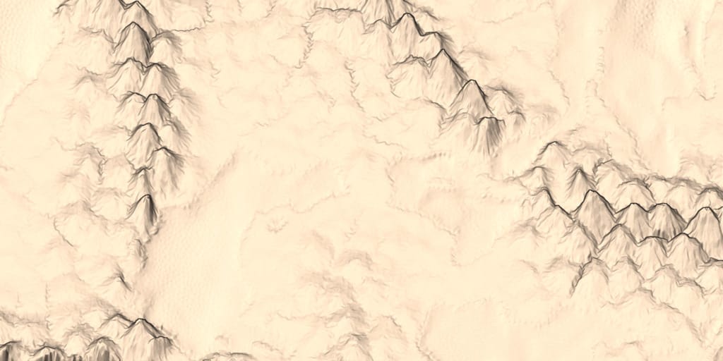
I then apply non-photorealistic lighting to make the mountainsides look more interesting:
The final color is the outline+lighting level (0.0 to 1.0) multiplied by the biome color:

I'm really happy with how it looks! My next steps are to improve performance and improve the visuals some more.
ไม่มีความคิดเห็น:
แสดงความคิดเห็น